Friday, September 23, 2011

What Goes Up...

UPDATE (845p, 23 Sep 2011):
Here's the latest map projecting the landing.  Estimated reentry time:  1210a CDT on 24 September ± 2 hours.


ORIGINAL POST:
Tonight the UARS satellite comes crashing back down to earth.  As of late afternoon on 23 September, it is projected to come down around 1100p ± 3 hours. The Center for Orbital Reentry and Debris Studies keeps abreast of the latest projections for where the satellite will reenter the atmosphere.


Each tick mark represents a five-minute increment. The entire four-orbit run shown above, represents the three-hour uncertainty period.  This uncertainty period has changed and shifted as more data becomes available. Last night's projections had it coming down just west of South America around 800p CDT with a 12-hour uncertainty period.  (And, therefore, last night on their site there were many more orbits shown.) 

However since then it has slowed more than predicted.  Changing its reentry time and the likely place of reentry to the areas shown above.

The debris field may be up to 500 miles long, with some two dozen or more pieces big enough to survive reentry and hit the Earth.  Areas near the point of reentry should be treated to quite the light show. 
At 630p CDT, it's over the South Pacific Ocean, beginning its curve northward toward Central America and Florida.  (See real-time images here.)


But what we really love is artist's renderings and graphical representations.  Here's a youtube video from a firm called AGI that shows how all this might take place:


Finally, you all should know a little bit about the satellite itself:

UARS (Upper Atmosphere Research Satellite) was launched in 1991 to better understand chemical constituents of the atmosphere and atmospheric photochemistry and transportation.  One of its first studies was how Mount Pinatubo's eruption carried its sulfuric acid and other volcanic gases throughout the atmosphere. 
 
From NASA's UARS Science page:

The satellite was launched in 1991 by the Space Shuttle Discovery. It is 35 feet long, 15 feet in diameter, weighs 13,000 pounds, and carries 10 instruments. UARS orbits at an altitude of 375 miles with an orbital inclination of 57 degrees. Designed to operate for three years, six of its ten instruments are still functioning. UARS measures ozone and chemical compounds found in the ozone layer which affect ozone chemistry and processes. UARS also measures winds and temperatures in the stratosphere as well as the energy input from the Sun. Together, these help define the role of the upper atmosphere in climate and climate variability.
Since some of its final orbits pass over North America, it's worth keeping an eye on the latest updates to see if you can watch the debris pass overhead.


Tuesday, August 30, 2011

Collective Mapping and Knowing Which Way to Run the Bases

I've taken a recent liking to OpenStreetMap.  OpenStreetMap, known often simply as OSM, is the wikipedia of mapping -- essentially, an exercise in collective mapping.  OSM is a worldwide, user-created map that can be edited by anyone.  It is then rendered by various different mapping engines, such as Mapnik, which is my current favorite.  The results can be viewed from openstreetmap.org or imported easily into various GIS software such as ArcMap, and used for many types of personal products.  The information is public domain, so there's no concerns about having to worry about map copyrights of a background Google or Bing or Yahoo map when making you're creating your own maps.

Since the information is user-driven, the level of information varies from place to place.  Many areas have decent levels of input, but some parts of the developing world need serious additions.    This is a Mapnik rendering of the area around the Cathédrale Notre Dame in Paris.

[Click on any map for larger, full-sized image.]
 
Central Paris
 Many roads, natural boundaries, and other features are imported from government data, including much of the US Census Tiger shapefiles.  However, much of the additional editing is done by users. 

If you have a large scale color plotter -- or even if you can print out several 8 1/2 x 11 sheets -- I find that OpenStreetMap is especially good as a physically-in-your-hands highway map.  Not only are the highways clearly labeled, but they're color coded by type of highway using standardized Tiger Census Feature Class Codes (CFCCs) so that you can tell whether that US-shielded highway is a divided, limited-access highway, an expressway with access to local roads at-grade, or a backwoods two-lane barely-paved road where you'll decelerate to 25 mph for every small town.   (Since this is a wiki project there's always a chance that something may be vandalized, but it's not like you can add an interstate highway without someone noticing.)

Highways around Upper Sandusky, Ohio.
 As you can see from the above maps, there are extensive tags that have been approved, far beyond the highways, streets, and natural and political boundaries.  There are amenities such as scenic viewpoints, museums, public restrooms, walking paths, ferries, military facilities, conservation areas...  the list goes on and on.

Natural areas around Jenny Lake, Grand Teton National Park, Wyoming

Most importantly, collective mapping can provide valuable pieces of information.  One of my favorite user edits is Fenway Park.  Now there's no excuse if you've just hit a line drive up the middle and you have no idea which way you should go.
Fenway Park.  Note the one-way arrows on the footpath marking the bases. 

I highly recommend playing around with OSM.  Drawing buildings is soothing in its own special way.  The tools are easy to use, and there are beginners guides for those just starting out and helpful hints on best pratices.   Before you know it, you'll have added detail to half your hometown. 

Thursday, July 7, 2011

You're Going to Make (a Map) After All

I've been on a 1970s groove as of late -- possibly due to Hulu's recent addition of the first three seasons of The Mary Tyler Moore Show to its offerings.  With Minneapolis as its setting, the show highlighted life in the Twin Cities in the early part of the decade.

The then-and-now factor is worth noting.

The tallest building in the Twin Cities in 1970 -- which is when The Mary Tyler Moore Show first aired -- was the Foshay Tower, built in 1929. The Quest Building and Minneapolis City Hall were built in 1932 and 1909 and came in second and third place.  You can see these all in this shot from the opening credits, as Mary drives into town in her white Mustang.


The Foshay Tower is on the left (the "St Paul" sign is pointing to it), the Qwest Building (at the time known as the Northwestern Bell Building) is in the middle behind and slightly to the right of the overpass below Minneapolis's arrow, and the City Hall it the building that looks like a castle off to the right. 

The great thing about Google StreetView is that you can compare this to today.


The Foshay is still barely visible, in front of the IDS Center, built in 1975.  Everything else in the Mary Tyler Moore still is pretty well obscured.  But even though the exit ramp seems to have moved, the overpass toward which she is driving looks distinctly the same.

To give you an idea of what the Minneapolis skyline looked like back then, here's a 1975 photo from the Minnesota Historical Society. The Foshay Tower is on the left.  The big building in the center is the then-newly-built IDS Center.  The picture is probably taken from the top of City Hall.


Here is another view of the skyline in 1975.  Loring Park is in the foreground. The IDS Center is on the left and the Foshay is just to the right of it.


Compare this to the 2007 skyline.  Loring Park, where the above photo was taken, would be is just a bit to the left.  The IDS Center is still prominent, but the Foshay Tower is harder to find -- it's the shorter building, right in the middle of the photo.  Minneapolis, it seems, grew up.

[photo credit: Steve Lyon]
I suppose a blog post about Mary Tyler Moore on a map blog wouldn't be complete without a map to the statue of her on Nicollet Mall, right?


Sunday, May 22, 2011

A flood in the middle of a drought.

More from the Atchafalaya...

The Army Corps of Engineers opened the Morganza Spillway last weekend, as I mentioned last week, flooding the Atchafalaya River basin over the course of the last several days.  The last time the river basin was flooded by the spillway opening was 1973.  Initially, crests this month were supposed to be as high as 1973 or higher.

However, for many places in the basin, such as Butte LaRose and Krotz Springs, flood crests are being revised downward and mandatory evacuations are being postponed.  There's a couple of reasons for this. 

First, there were simply fewer floodgates to the spillway opened in 2011 compared to 1973.  Fewer floodgates means less water. But the second reason is the ongoing drought in the south.

The Drought Monitor from the University of Nebraska-Lincoln identifies current drought conditions on a scale of D0 to D4, with D0 being a drought watch or having abnormall dryness and D4 being "exceptional drought."  They put out reports weekly, with online archives going back to January 2000.

Louisiana drought conditions, 5/3/2010.
D0 = yellow, D4 = brown
(Source: Drought Monitor)

On May 3, the Drought Monitor classified 95% of the state of Louisiana as at least D1 (moderate drought), and more than 40% of the state being at least D3 (extreme drought).  It's part of a general extreme to exceptional drought that has been ongoing for most of the late fall and winter.  Parts of Texas have seen the worst of the drought, but parts of Louisiana have seen their share as well, as you can see above.

Since then, the spillway has been opened. 

Louisiana drought conditions, 5/17/2010.
D0 = yellow, D4 = brown
(Source: Drought Monitor)

As of May 17, 21% of the state has no drought conditions.

It's not like southern Louisiana has received much rain in the past month to alleviate the drought. In fact, it's running four inches below normal for the last 30 days.

30-day Precipitation Deviation, 5/22/2011.
Orange is 3-4 inch rainfall deficit -- Red/Brown is 4-6 rainfall deficit
(Source: National Weather Service)

But when you open a spillway, whether it's Morganza into the Atchafalaya or Bonnet Carre into Lake Pontchartrain, it's going to solve your dryness issues. If you look closely, you'll see the May 17 map only shows drought recovery in those basins. 

This dryness has been slowing the extent of the water as the parched ground absorbs the water. In contrast, the 1973 spillway opening came on the heels of two weeks of rain.

Wednesday, May 18, 2011

When it absolutely, positively needs to have a map

Those people who know me personally already realize that I'm a big fan of cargo freight.  I have a extra-special fondness for shipping container freight, but I find air freight interesting too.  Add to this the simple fact that I've found a lot of FedEx related maps lately, and you get a post solely about FedEx.

FedEx is based out of Memphis, Tennessee, where it has its "superhub" at the Memphis International Airport.  It has a fleet of nearly 700 aircraft flying to almost 400 destinations.  And one extremely overwhelming distribution center.


The constant movement in these and other similar distribution centers are amazing.  Conveyor belts run everywhere, forklifts scuttle about, and you have to be on your toes that you don't get run over. These places are darn near hyperactive.

But on to the maps...

FedEx, with its famed overnight delivery service, runs 24-7. And with that 24-7 business, they have flights flying into their Memphis superhub and Indianapolis and Dallas regional hubs constantly. Here is a time lapse video of 25 hours of FedEx flights back and forth across in the continental US:, accompanied by a little acoustic Led Zeppelin.  Watch the timing of how almost all the planes are on the ground in Memphis at the same time to sync their delivery routes.


I find it a little ironic that a time lapse video of airplanes flying to Memphis is accompanied by Zeppelin singing a song entitled "Going to California", especially when there are both more appropriately titled groups and songs that mention flying into Memphis available.

It should be noted that this is Memphis, which is located in the South, where summer storms can wreak havoc on even the best run air traffic systems.  When storms develop, the orchestration of in-bound flights can look like a well-choreographed dance.


Part of FedEx's website has been devoted to demographic and sociological cartograms.  Cartograms are a different kind of map -- one where some variable, such as life expectancy or happiness rating or population, is substituted for land area in a map.  (For example, many people are familiar with cartograms from US Presidential elections.)


FedEx cartogram showing differences in R&D expenditures.
These cartograms on FedEx's site are some of the most dynamic collections of cartograms that I've seen in a long time. They display worldwide demographic data, usually three related topics at a time, morphing the world to show each set of data.  The data range over a wide range of topics as well -- from airline travel to mobile phone usage to coffee imports to education spending -- just to name a few. The demographics expressed within the project are fairly extensive and they are constantly adding more. 

Flip through them and you'll find a wealth of information.  The one drawback is that you need to hover over the unlabeled country to get specific information.  When the countries get distorted you may find yourself hovering over several likely candidates if you have a specific country you want to find.  But still, it's a wild method of displaying worldwide demographic differences.


One last comment about FedEx that appeals to the font geek in me.  Their logo is one of the most subtly creative logos currently in existence. The company created its own font in order to achieve a hidden extra something within the logo that adds to their brand.  See if you can find it.  If you can't, the answer can be found here.

Saturday, May 14, 2011

It's fun to say "Atchafalaya"

Before I begin, I need to say it’s just fun to say Atchafalaya. Say it aloud: Atchafalaya. Ah-CHAF-fuh-LIE-uh. Native American place names in the South, like Atchafalaya and Chattahoochee, are just as fun to say as Native American place names from the North, such as Winnipesaukee and Kinnickinnic.

The Atchafalaya River has been in the news as of late. The flooding in the Lower Mississippi River, which I mentioned earlier last week, is slowly working its way downstream toward Baton Rouge and New Orleans. This flood is of epic proportions – levels this high have not been seen in the area since 1937.

The Atchafalaya is a distributary of the Mississippi. (A river distributary is the opposite of a tributary. A tributary is a river that feeds water into a main river; a distributary is a river that takes water from a main river, often in a river delta area.) Since the 1860s, the Atchafalaya has been growing, taking more and more water from the Mississippi and diverting it through central Louisiana to the Atchafalaya’s mouth south of Morgan City. In the mid-19th century the Atchafalaya took 10% of the Mississippi's water.  Today, it's 30%.

The Army Corps of Engineers will alleviate some of the flooding in a similar, yet slightly different, manner to which they did upstream near Cairo, Illinois, a couple of weeks ago.

Upstream the Mississippi is penned in by a series of dikes which keeps flooding out of cities and farmland on either side of the river. The Corps blew up some of the dams on the Missouri side of the river to keep the river from topping the dikes around Cairo, effectively sacrificing farmland on the Missouri side to save the Illinois city of 3000 people.

 Changing Mississippi River deltas over the past 5000 years

In Louisiana, however, the problem is more complex. The Mississippi River has found several outlets in the Gulf of Mexico over the course of the last 5000 years through a wandering of its delta in a process known as avulsion. Since the Mississippi lays down such a large amount of silt into the gulf, the river delta grows longer and shallower over time, with gravity coaxing the river to constantly search for newer, steeper, more efficient outlets to the sea. For most of the last century, the Army Corps of Engineers has been charged with the significant task of keeping one navigable channel via the Mississippi.

Old River Control Structure. Red line indicates the Atchafalaya Outflow Channel.
Through a series of dikes and spillways, primarily at Old River Control Structure near Red River Landing and the Morganza Spillway near Morganza, the Corps has prevented the Mississippi from finding a more westward course. And, as long as the water levels stay low enough, it’s a difficult but possible feat. However, the Mississippi is a powerful force. With recent flow rates reaching 1.5 million cubic feet per second above Baton Rouge due to the flood, the Mississippi is an even more powerful force than normal.

(Check out this interactive map of both the Atchafalaya and Mississippi River systems in Louisiana showing where the river basins, spillway and dike systems, and diversions in the two river systems are located.)

Today the Corps opened the Morganza Spillway into the Atchafalaya. The reasons are twofold: first, the flood is high enough that the river would top the control structures even if they were not opened, which is dangerous; and second, Baton Rouge and New Orleans would be inundated without it. One news report stated that if the Morganza Spillway (just downstream from Old River) and the Bonnet Carre Spillway (just west of New Orleans) were not opened, that New Orleans could be swamped with over 20 feet of water. Memories of Hurricane Katrina come to mind.

The parts of the Atchafalaya basin that would flood are home to 25,000 people and 11,000 structures. The population in the basin was given several days' warning before opening.  Even after opening the spillway, significant time would pass for the waters to reach the southern parts of the basin.

Travel times from when the spillway opens until when floodwaters reach an area
 The limited diversion into the Atchafalaya may save New Orleans in the short-run. But in nearly every article I’ve read, experts about the river for the past 150 years have repeatedly said that eventually the river will turn west, sooner or later, leaving a significantly smaller Mississippi to run through Baton Rouge and New Orleans -- and an economic devastation to the chemical and shipping industries there that rely on the river. The Corps is charged with not letting that happen. But nature makes a formidable adversary.

To learn more:

Louisiana Old River Control Structure and Mississippi River Flood Protection
Has some wonderful maps that show how the history of the control structure and how the levees work.

Flooding Scenarios for the Mississippi and Atchafalaya Basins
Three flooding scenarios run by the Army Corps of Engineers, released May 8, 2011. The first opening the Morganza Spillway 50%, the second by not opening Morganza Spillway, and the third by diverting water through the Old River Control System.

Atchafalaya
An article from New Yorker Magazine from 1987 that provides a rich history of the area and a look into the local perspective on controlling the river both in a current (1987) perspective and a historical perspective. It looks into the 1927, 1937, and 1973 floods, and what happened to the control process before and after these floods.

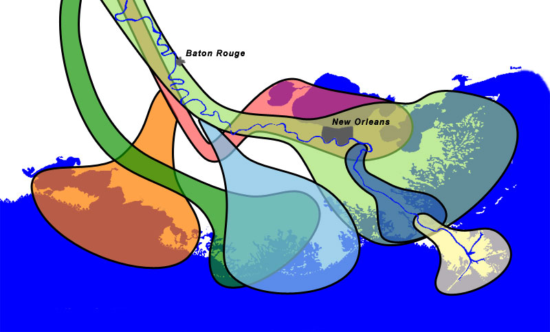
Interactive South Louisiana Map
The interactive map mentioned above showing the river basins, spillway and dike systems, and diversions in the two river systems are located.

Friday, May 13, 2011

Personal Maps

There are a lot of personal maps out there on the web devoted to where people have been, what people have done, where family lived in the past...  if you can map it and it's about you, that's a personal map.

Some of the most prolific personal maps are non-electronic and found on the backs of motor homes and RVs.These are typically maps of the United States and/or Canada and consist of a set of state or province-shaped stickers. 

The rules go like this: if you visit, drive through, or camp in a state, you get to put the decal on.  There is quite a debate among RV enthusiasts about whether you actually have to camp there (in your RV) to get the sticker or if you just have to drive through it. The debate is, from what I hear, a bit of a big deal.

The high-tech version of the RV decal collection was made popular by Facebook.


A "Where I've Been" app map.  Red = "lived there." Blue = "been there."

Facebook was one of the first to make personal maps both easily accessible and popular with the online "Where I've Been" app. Their initial app allowed you to create a map by checking a list of the states, provinces, and/or countries you've been to or lived in.

You can go crazy will the virtual pushpins with this version of "Where I've Been."
Later iterations allowed you to go into further detail about the cities you've been to, the places you've actually lived in, and the places you've merely wanted to visit.

Flightmemory.com is one of my favorites.  It's especially nice for people who fly quite a bit, since it won't stay static for years at a time.  It not only allows you to keep track of where you've been, but also what flight you were on, when it took off and landed, your satisfaction with the airline, if you flew for business or for personal reasons, which class you flew in, and whether you had a window, aisle, or center seat. The information you choose to enter is up to you.

The site logs all of the geographic information and creates a handy map.


There are single-country maps if you've flown domestically, and a world map if you've flown internationally. If you have intra-European flights, those are also given on a separate, zoomable map. 

You can also enter your flight ahead of when you book it.  Flightmemory keeps a real-time map of the users who are in the air at the time you check it.


Flightmemory users in the air at 0330GMT on 5-12-2011.

In addition, depending on how much information you choose to enter, you'll get information on your Top Ten Airports, Top Ten Airlines, Top Ten Routes, and Top Ten Aircraft.  I found out through this process that my personally most popular airport to fly through away from home is not Detroit, like I thought, but Milwaukee's Mitchell Field.

You can go a step further and create all sorts of fun, detailed work on your own if you have access to a full-fledged GIS program.  The people over at radicalcartography.net -- who rate high enough for me to write an entire column someday devoted solely to some of the incredible mapmaking they do -- have created personal maps that show the highways they been on across the United States and Canada. 

The interesting thing about radicalcartography's personal highway maps is that they have consciously chosen to not put any markers on the maps -- nothing except for the highways themselves: no highway labels, no state boundaries, no oceans, no rivers or lakes -- just the highways.  It makes for an interesting perspective, especially if a person, say, flies into a city and never leaves the metropolitan area.  


Mark's North America, mid-2010.
Can you tell the destinations?  Was one the Pacific Ocean?

My version of this map was drawn with ArcGIS. It uses only state, provincial, and national highways, except for in instances where a county road was needed to make a particularly long road trip look like we didn't hop in a helicopter for 20 miles. It, like most of my personal maps, is a work in progress.

Sunday, May 8, 2011

Redistricting Extravanganza

Last Monday, The Minnesota House released its proposal for the 2012 redistricting for the Minnesota State Legislature. Rep. Sarah Anderson (R-Plymouth) submitted the proposal, which passed the House Redistricting Committee on a 7-5 vote along party lines. 

Twin Cities Metro Area House Redistricting Plan
Anderson stated that the plan intended to keep cities, counties, and areas of common interest confined to one district. Democrats have attacked the plan as partisan, pairing up several incumbants as lines are redrawn. None of this is surprising.  And here in Minnesota, with a Republican-controlled State Legislature and a Democratic Governor, redistricting will likely end up being drawn by the court system anyway.

It's pretty darned easy these days, especially with the redistricting software out there, to draw areas that are small, compact, and accomplish political ends at the same time. And some of the biggest names in mapping make redistricting software.

Some places, such as Sacramento, have put redistricting software online for the public to use for free. It's pretty self-explanatory for someone who is familiar with the way mapping software works, but for a novice, it could be pretty daunting. Anyone can try it out and submit a plan. (Note: Their deadline for input of publicly drawn plans is May 16, 2011.)


The Redistricting Game
There's a great online educational program about the redistricting process called The Redistricting Game [warning: there's automatic audio on the intro page] that walks you step by step through some of the hurdles that redistricting process faces: politicians who gerrymander to give their party an edge over the other, politicians who gerrymander in a bipartisan manner to preserve incumbency, and the complexities of creating minority majority districts allowed under the Voting Rights Act.  The game is a simpler attempt at doing redistricting, and there's basic and advanced levels of the game.

A hypothetical 2012 redistricting I did for Nebraska's
three CDs using Dave's Redistricting Online
Want to do it all yourself with real state-level data?  "Dave's Redistricting Online" has a free online application to do just that. It's fun to play around with, even if you just want to hypothetically gerrymander your favorite state senator into an open Congressional seat.  You basically just color the map with your cursor. There are options to base your plans on the 2000 apportionment, or just start from scratch.  Dave's tool lets you change the number of seats you're drawing for, which is good if your state was on the bubble of gaining or losing a Congressional seat.

The tool also keeps track of race and ethnicity data -- both for voting age persons and the general population -- by each individual voting district and by your newly drawn Congressional district.  Plus, it will let you know how each geography voted in the 2008 Presidential election.  That's handy if you want to lean a district to one party or another. It will export the data by precinct into a csv file, which could be easily joined to if you had a corresponding shapefile.

If Congressional reapportionmant is not up your alley, you can also draw up state level legislative districts with the tool, because Dave lets you crank that number of seats for which you're drawing boundaries up to 499.  Want to draw lines for the 99 Wisconsin State Assembly seats?  Not a problem.  Want to draw lines for the 203 seats in the Pennsylvania House of Representatives?  Still not a problem.  The 400 seats in the New Hampshire House?  Yes, Dave's program will let you do draw those 400 districts, but New Hampshire draws their districts by county and often has multiple representatives per district, so his tool isn't going to help you.

The program does have some minor flaws.  It could use a bigger paintbrush or a way to select multiple voting districts at a time, perhaps an entire county. (Coloring every voting district in Clark County, Nevada?  A bit of a pain.) But for a free educational mapping tool that churns out some decent maps and a ton of demographic data?  I'm impressed.


Thursday, May 5, 2011

Mississippi Riverwalk on Mud Island

I've always been a big fan of large scale models of geographic features.  This one came to my attention after reading about some of the recent Lower Mississippi River flooding -- the worst flooding on that part of the river since 1937.

The Mississippi Riverwalk is a sculpture located in Memphis's Mud Island River Park located just west of downtown Memphis in the Mississippi River.  (It should be noted that Mud Island is not actually an island. However, being from the Twin Cities, I know that these types of things happen.)


The model of Memphis on the Mississippi Riverwalk in Memphis. (photo: Thomas R. Machnitzki)
The sculpture is a half mile long with a horizontal scale of 30 inches to 1 mile. It captures the Lower Mississippi from Cairo, Illinois -- where the Ohio River meets the Mississippi -- to the Gulf of Mexico.  It has a vertical scale of 1 inch to 8 feet, so you can see the channel that has been carved over the years. An average of 1.2 million gallons of water flows through the system. Parts of the sculpture are deep enough to double as a wading pool.

My favorite part of this section of the sculpture is that you can see little scale models of the I-40 and I-55 bridges over the river. The detail in the cities and bridges is amazing.

As if the sculpture wasn't reason enough to go, one of the ways you can get to the park is by monorail.

Either way, it is very, very cool. However, I do need to say that though that I'm just a bit disappointed that the Upper Mississippi River isn't represented.

Regardless, I need to go see it.  And have some barbecue while I'm there.

Tuesday, May 3, 2011

Tornado Outbreaks

The Super Outbreak of April 3-4, 1974, was until last week the largest tornado outbreak in American history. One hundred forty-eight tornados rampaged across thirteen US states and the Canadian province of Ontario, killing over 300 people.
1974 Super Outbreak. Map from NWS
Though I was too young to remember the outbreak, I was told stories about the event when I was young. My dad was in Xenia, Ohio, on business the morning of the outbreak, and left the town only hours before it was hit by an F5 in late afternoon. Between that story and other tornado sightings in the 60s by members of the family, tornadoes were talked about a lot when I was growing up. Add to this that the house we lived in had no basement, and you might see why I have a fascination with tornadoes.

Last week’s April 25-28, 2011, outbreak killed over 350 people. Tuscaloosa and Birmingham, Alabama, were especially hard hit, but devastation was seen all over the South. On April 27 alone, there were 257 tornadoes, with more than 425 over the four-day period.
2011 Outbreak.  Map from NWS

Different mapping technologies over the 40-year span, yes. But it's the length of the 2011 paths that you can really only see in the maps that really gets me.